Last week (4/10/2017), I started studying at Metis, an immersive 12-week data science and machine learning program based in San Francisco.
For our first project we interpreted data made publicly available by the New York City Metro Transit Authority (MTA). (You can access the data here.)
After a few hours of playing with Python and its pandas functionality, I was able to create a chart that looks something like this:

The data shows traffic the 1st Ave station over a period of one week in April 2017. I remarked tongue-in-cheek to a fellow student that this looked like something I could have pulled together in a few minutes with Excel.
But pretty quickly after getting that first chart made, I was able to then produce other similar charts for other MTA stations, compare traffic between them, and sort stations by cumulative entries and exits. I was impressed with the speed at which Python and pandas could interpret and manipulate the data. The experience made clear to me that, while I could do graphing and sorting with an application like Excel, I was dealing with more than 196,000 rows of data -- even the simplest function in Excel would crash the system. But no problem in pandas.
Here is a histogram I created that shows the number of stations that received what traffic levels in April 2017:

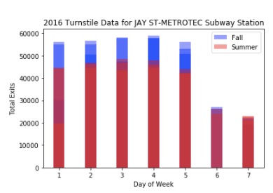
With the ability to manipulate and interpret data quickly, you can then use pandas to find meaningful trends. For example, with just a few lines of code, I put together a chart that shows that, at certain subway stations, there appears to be seasonal differences in subway traffic rates. This chart shows the difference in traffic between fall and summer 2016 at the Jay Street subway stop near the New York City College of Technology:

And here is a chart that shows traffic by day of week at that same Jay Street station. Red values are traffic in the summer. Blue is traffic in the fall. This chart shows not just that traffic patterns in fall 2016 tended to be higher than the summer 2016 at the Jay Street station, but how that traffic varied depending on day of week. Where there is overlap in the sets between red and blue the color hue is darker:
Next week we'll be looking at machine learning and linear regressions...